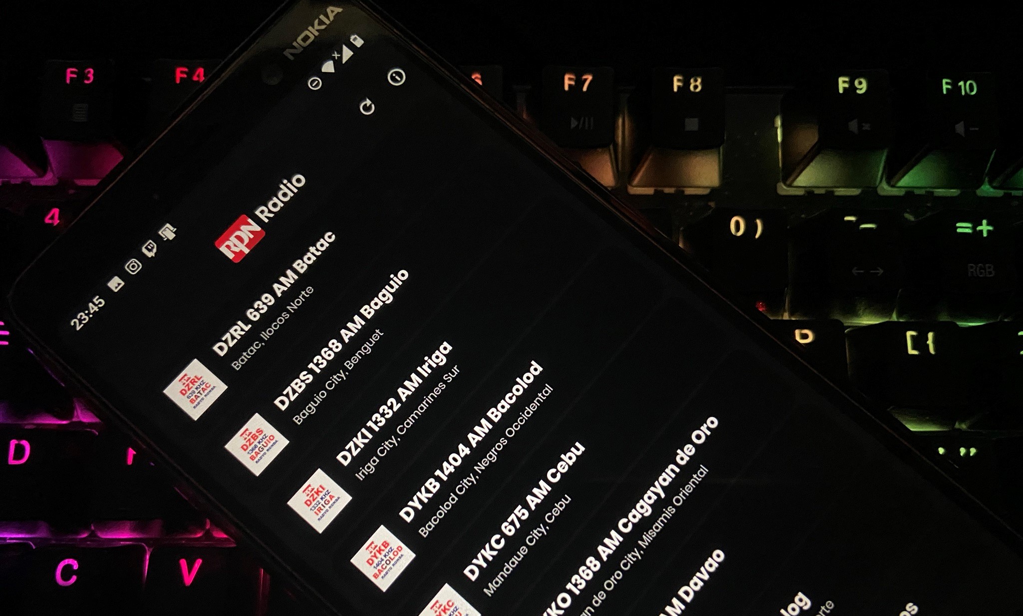
Browsing Instagram on my account now floods me with several UI/UX tips and practices, making me inspired to update and retouch my apps with some latest trends in mobile designs.
Old Look
Let’s take a look at what the app looked like before the update:
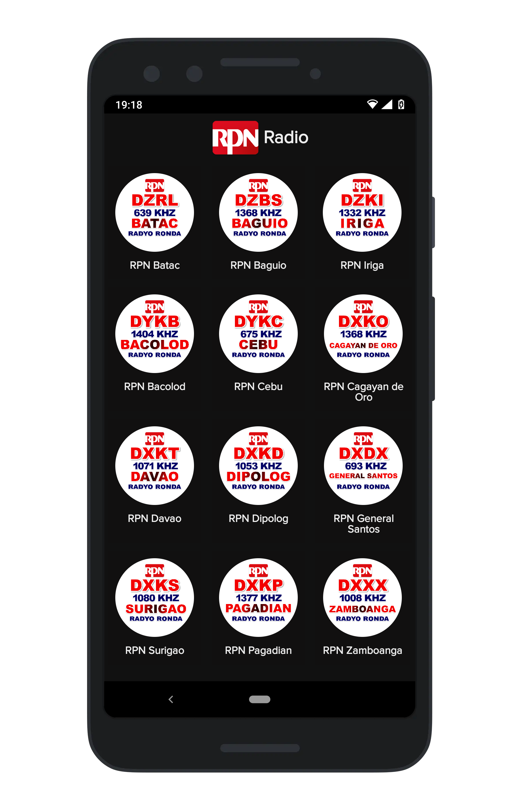
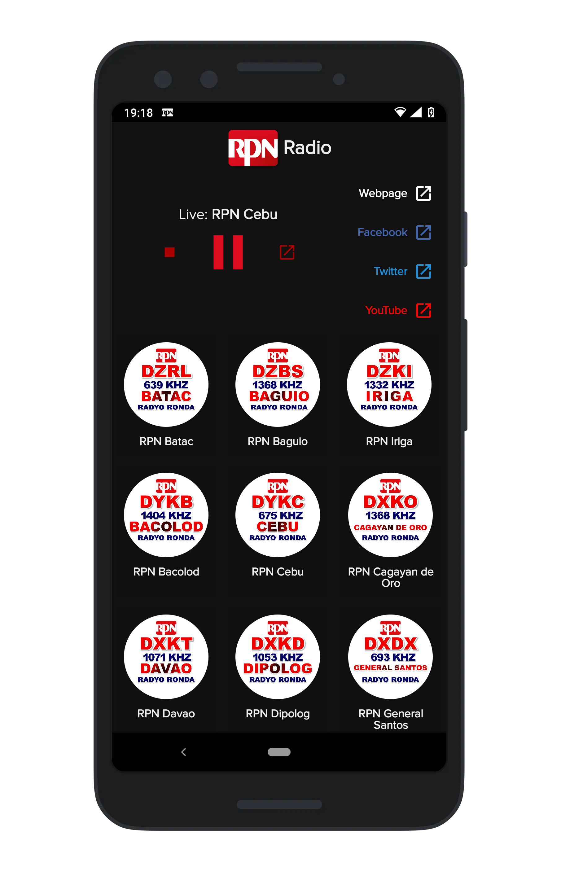
Though it looked intuitive - with just two simple steps: 1) Launch app, 2) Select station and Listen; the main page does not give the user context on what the app does, which raise this question:
What am I supposed to do?
Overhaul

Menu List
At first glance of a first-time user, the stations list does NOT show that it is “clickable”. So the first UI update was to change the 4x3 grid to a simple list.

Station Menu Item Before and After
This subtle change provides the user a hint of “click me” by giving the list item a design of a button. It also gave a space for the station’s detail to be added - station’s location and live/offline status.
Header and Controls
Ok, this area will look crammed especially on small-screen devices. Before this update though, I repositioned the buttons below the controls and were still crammed. This update allowed the horizontal list to be scrolled.
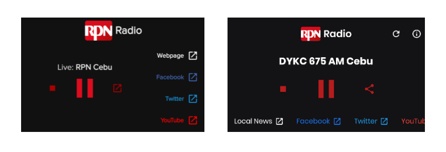
Header & Controls Before and After
I also changed the text that shows the current stations into a simpler one and updated the share icon.
New Font
I like Poppins.
About
Besides the UI updates mentioned above, I added an “About” page. It is a simple about and external links of RPN.
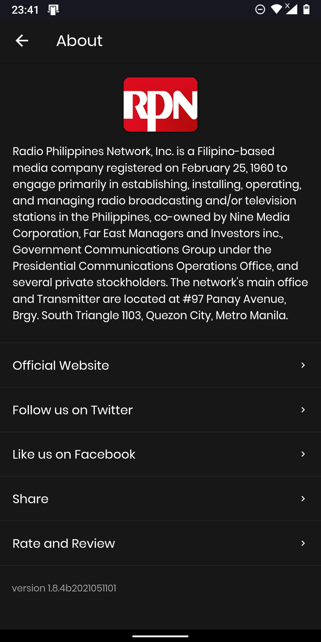
About page
Roadmap
These are my to-do list for the app, which we will see soon on future updates:
- No internet connection status
- Bottom player controls (Priority)
- App-aware sharing
- Rate and review prompt
- Links to station email/messaging
Downloads
As always, the app is still available for Android and really soon for iOS.
